⚠️ Vigilance orange canicule – Accueil de jour exceptionnel
Un accueil de jour exceptionnel est assuré les jeudi 6 et vendredi 7 août, de 15h à 19h, au gymnase du Peloux (187 passage de l'École du Peloux, Bourg-en-Bresse).
Rapport d’observation du SIAO 2024
Le rapport d’observations 2024 portant sur l’année 2023 est disponible, vous pourrez le consulter ici. Vous y retrouverez une présentation du SIAO de l'Ain, des chiffres et…
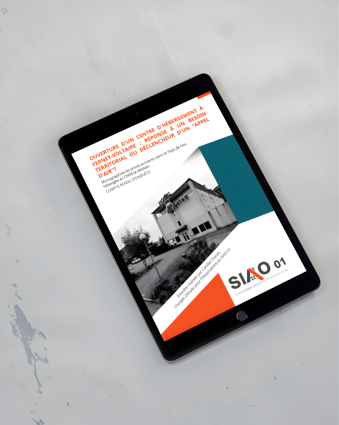
Enquête :
Un « appel d’air » créé par les structures d’hébergement ?
Le CHRS du Médian à Ferney-Voltaire, suite à son ouverture en 2021, a parfois été désigné comme…
Rapport d’activité hébergement-insertion 2023
Le rapport d’activité 2023 portant sur l’année 2022 est disponible, vous pourrez le retrouver ici Au sommaire, les chiffres de l’urgence et de l’insertion, les nouveautés proposées par…
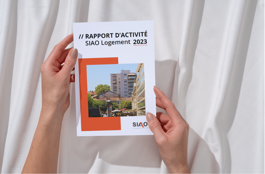
Rapport d’Activité Logement 2023
Le rapport d’activité 2023 portant sur l’année 2022 est disponible, vous pourrez le retrouver ici. Au sommaire, les chiffres de la reconnaissance public prioritaire, un focus…
Le contrat d’engagement jeune arrive dans l’Ain
Un nouveau dispositif voit le jour dans l’Ain !
L’association CAPSO, la Mission locale et le SIAO s’associent pour mettre en place dans le…
Gérer le consentement
Pour offrir les meilleures expériences, nous utilisons des technologies telles que les cookies pour stocker et/ou accéder aux informations des appareils. Le fait de consentir à ces technologies nous permettra de traiter des données telles que le comportement de navigation ou les ID uniques sur ce site. Le fait de ne pas consentir ou de retirer son consentement peut avoir un effet négatif sur certaines caractéristiques et fonctions.
Fonctionnel
Toujours activé
Le stockage ou l’accès technique est strictement nécessaire dans la finalité d’intérêt légitime de permettre l’utilisation d’un service spécifique explicitement demandé par l’abonné ou l’utilisateur, ou dans le seul but d’effectuer la transmission d’une communication sur un réseau de communications électroniques.
Préférences
Le stockage ou l’accès technique est nécessaire dans la finalité d’intérêt légitime de stocker des préférences qui ne sont pas demandées par l’abonné ou l’utilisateur.
Statistiques
Le stockage ou l’accès technique qui est utilisé exclusivement à des fins statistiques.Le stockage ou l’accès technique qui est utilisé exclusivement dans des finalités statistiques anonymes. En l’absence d’une assignation à comparaître, d’une conformité volontaire de la part de votre fournisseur d’accès à internet ou d’enregistrements supplémentaires provenant d’une tierce partie, les informations stockées ou extraites à cette seule fin ne peuvent généralement pas être utilisées pour vous identifier.
Marketing
Le stockage ou l’accès technique est nécessaire pour créer des profils d’utilisateurs afin d’envoyer des publicités, ou pour suivre l’utilisateur sur un site web ou sur plusieurs sites web ayant des finalités marketing similaires.